Highly revered bistro.
Ranked as the number one bistro in East Belfast, The Hoose had developed a stunning interior and exterior transformation, which featured a modern and chic design. This created an atmosphere of comfort and quality to match its highly revered gastronomical menu. But they also needed its branding to fall in line with this fine dining aesthetic and tie everything together. With that in mind, they partnered with us and we kicked off the project with them at Platform Media HQ.
01.
Timeless elegance.
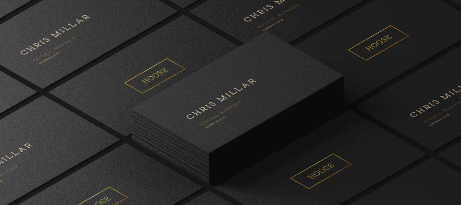
It was clear the image of the restaurant was missing a final piece. After our research and development process, our plan was to instigate a full rebrand, which would include a new logo that would then be displayed on new backlit outdoor signage, which we would design, build and install. It could also then be used across all new table menus and distributed on new business stationery to then eventually roll out to their social media channels. Defining how we portray the brand across multiple platforms and mediums is crucial to get a feel for how we can roll a new identity out within any development plan we undertake.


02.
Adaptable across mediums.
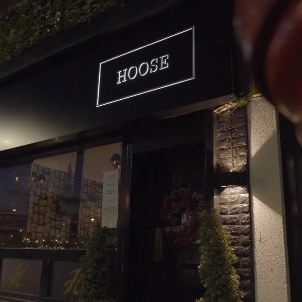
The concept began with the crucial aspect of aligning the brand with the business objectives, communicating that brand to the target market and maintaining the brand as a presence within the market. A timeless elegance / a fresh and simple look for use across their business / adaptable for use across multiple mediums and platforms, from their website and social media to their new signage and menus. The result? Fine gold text in a box logo composition, exuding class and contemporary design, especially when displayed against a rich, black background. This attention to the bold contrast makes the logo stand out across marketing platforms and branded materials.

03.
Glowing application.
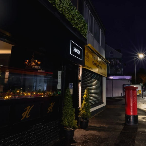
The biggest and most impactful element of our overall plan was the crux of this contrasting element; The new signage. Our stunning new logo design would be backlit with LEDs glowing against a matte black surround and would be hugely impactful in their location on a main arterial route in and out of the city with heavy traffic flow.
Once we had this design and format nailed down, it would then trickle down through the business within the brand guidelines. Keeping everything tight and literally on brand.

04.
Warm and welcoming.
This was a transformation which worked on every level as briefed by the client. A warm, welcoming and comfortable interior with natural materials such as stone and wood combined with soft, industrial splashes provided the perfect backdrop for our designs to settle and shine. The crisp and clean manifesto we all worked from was evident from outside the front door to in front of the counter to in front of the customer in the form of the menu at the table. A 360 degree branding and visual project which fulfilled the brief and then some giving the already established identity a flourish, providing them a reinforced standing in their busy location in suburban Belfast. Job done. Coffees all round.
More work
Check out our google reviews
Noel and the team top class, standard of design & print as well as turnaround time under pressure, never fails to deliver, would highly recommend .
The team at Platform Media have been very professional and helpful to us as we commenced our e-Commerce journey. They have gone the extra mile and we couldn't have managed it without them.
Great service, very helpful staff, and turn around excellent, as is quality and value for money.
An amazing company with fantastic Individuals. We use Platform for all our marketing, videography and graphics. I would recommend them to everyone
We have been using Platform Marketing Agency's digital marketing services for nearly two years. Their support to us has been excellent and their expertise is unrivalled in the industry. Our business, ShredBank, has grown significantly as a result of their highly effective digital marketing support. I have found them to be very personable, professional and always available to assist and advise us in growing our brand. Philip Bain, Co-Owner of ShredBank
Great experience with Platform, have used them for multiple things over the last 10 years or so. Great service with a personal touch. Thanks guys!
The team at Platform Marketing Agency are great. They are solutions-focused, highly skilled and take great care of their customers. I would have no hesitation in recommending Platform Marketing.
Can't recommend Platform Marketing enough! They've been running our website for years now and couldn't be more helpful. Any question or maintenance issue is resolved immediately and they go above and beyond on so many occasions. Thank you Noel and team!
The staff at Platform Media have gone above and beyond the call of duty help me in my business. From physically printing my products to guiding me on my branding and design journey, I have been blown away by the customer service I have experienced and would struggle to find any faults at all. Prices and quality of print are unmatchable and on top of it all, they are family run local company here in my home town. Would recommend them to anyone who has had bad experiences with printers as I've had in the past. They are a welcome breath of fresh air in a stuffy and sometimes stifling industry.
