

Website accessibility is often treated as a technical requirement or a legal concern. In reality, it’s a fundamental part of how people experience your website.At Platform, we see accessibility not as an add-on, but as an extension of good design, clear content, and thoughtful user experience. When accessibility is overlooked, it doesn’t just exclude some users, it creates friction for many users.
In this article we explain why accessibility matters and outlines practical ways to improve it without overcomplicating the process.
What Is Website Accessibility?
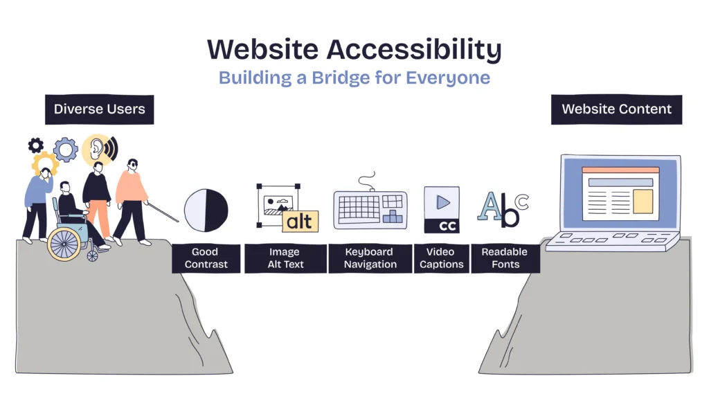
Website accessibility means designing and building websites so they can be used by as many people as possible, including users who may have:
- Visual impairments
- Hearing impairments
- Motor limitations
- Cognitive or neurological differences
- Temporary or situational limitations (e.g. injuries, poor lighting, slow connections)
Accessibility isn’t about designing for a niche audience, it’s about acknowledging that users interact with websites in different ways.
Why Website Accessibility Matters
1. Accessibility Improves Usability for Everyone
Many accessibility best practices also improve general usability:
- Clear navigation benefits all users
- Readable text helps users on small screens
- Logical structure improves scanning and comprehension
Inaccessible websites are often just harder to use, even for people without diagnosed impairments.
2. Accessibility Reduces Friction and Drop-Off
When users struggle to:
- Read content
- Navigate with a keyboard
- Understand page structure
- Complete forms
they’re more likely to leave, not because they’re uninterested, but because the experience feels unnecessarily difficult.
Accessibility improvements often lead to smoother, more intuitive journeys.
3. Accessibility Supports SEO and Performance
While accessibility and SEO are not the same thing, they overlap in meaningful ways:
- Semantic HTML improves content structure
- Descriptive headings help search engines understand pages
- Alt text clarifies the purpose of images
- Clear link text improves crawlability
Accessible websites are usually better structured and easier to interpret, both for users and search engines.
4. Accessibility Reflects Brand Values
A website sends signals about how a business thinks.
An accessible site communicates:
- Consideration
- Professionalism
- Attention to detail
- Inclusivity
For many users, these signals influence trust, often before they consciously register why.
Common Accessibility Issues on Websites
Accessibility problems are rarely dramatic. They’re usually small, accumulated issues, such as:
- Low colour contrast between text and background
- Missing or unhelpful image alt text
- Forms without labels or instructions
- Headings used for styling instead of structure
- Interactive elements that can’t be used via keyboard
Individually, these may seem minor. Collectively, they create real barriers.
Practical Ways to Improve Website Accessibility
Accessibility doesn’t have to be overwhelming. Small, deliberate improvements can make a meaningful difference.
1. Improve Text Readability
Start with the basics:
- Use sufficient contrast between text and background
- Avoid very small font sizes
- Limit long blocks of dense text
- Use clear, consistent spacing
If text is hard to read, nothing else matters.
2. Use Headings Properly
Headings aren’t just visual, they define structure.
Good practice includes:
- One clear H1 per page
- Logical heading order (H2 → H3, not skipping levels)
- Headings that describe content, not just decorate it
This helps screen readers and improves content clarity for all users.
3. Write Meaningful Alt Text for Images
Alt text should describe the purpose of an image, not just its appearance.
Ask:
- Does this image add information?
- Is it decorative?
- What would a user miss if they couldn’t see it?
Decorative images can be ignored; informative ones need context.
4. Make Forms Easier to Use
Forms are one of the biggest accessibility pain points.
Improvements include:
- Clear labels for every field
- Instructions that don’t rely on placeholder text
- Error messages that explain what went wrong
- Logical tab order for keyboard users
Accessible forms are also more likely to be completed successfully.
5. Ensure Keyboard Navigation Works
Some users don’t use a mouse.
Check whether:
- All interactive elements can be accessed via keyboard
- Focus states are visible
- Navigation flows logically
If something can’t be used without a mouse, it’s likely blocking more users than you realise.
6. Avoid Relying on Colour Alone
Colour should support meaning, not carry it entirely.
For example:
- Error states shouldn’t rely only on red
- Links shouldn’t be identifiable only by colour
- Status messages should include text cues
This helps users with visual impairments and improves clarity overall.
Accessibility Is a Continuous Process
Accessibility isn’t something you “finish”.
As content changes, features are added, and user behaviour evolves, accessibility needs ongoing attention, just like performance, SEO, or conversion optimisation.At Platform, we treat accessibility as part of building websites that are clear, usable, and future-proof, rather than something bolted on later.