
At Platform, we see many businesses invest heavily in traffic generation, only to overlook what happens once users arrive. In practice, most websites don’t suffer from a lack of visitors, they suffer from avoidable friction.
Conversion Rate Optimisation (CRO) is often reduced to surface-level changes, but meaningful improvements usually come from clarity, structure, and alignment with user intent, not cosmetic tweaks.
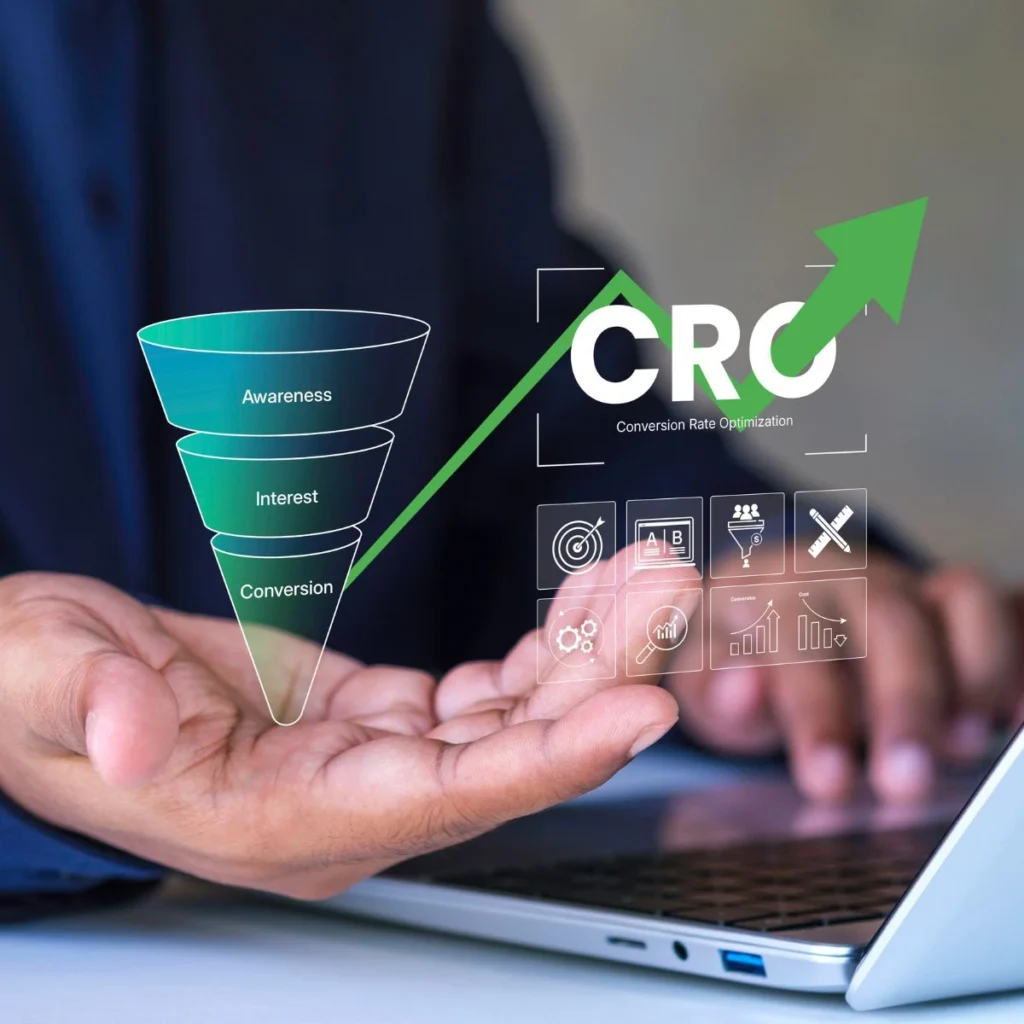
Below are Conversion Rate Optimisation tactics that are frequently underused, yet consistently effective when applied thoughtfully.
1. Optimise for Decision Confidence, Not Just Clicks
Users rarely hesitate because they don’t want to click. They hesitate because something feels uncertain.
Before committing, people want to understand:
- Whether the solution fits their situation
- What happens after they take action
- What risks they’re taking on
Adding small but deliberate reassurance near key actions, such as explaining next steps or removing ambiguity, often has a greater impact than increasing urgency.
Practical tactics:
- Add expectation-setting copy near CTAs (“No contracts”, “Takes under 2 minutes”, “Cancel anytime”)
- Use process transparency (“Step 1 → Step 2 → Step 3”) to remove uncertainty
- Clearly state what happens next after a form submission or purchase
Reducing anxiety often increases conversions more reliably than increasing urgency.
2. Treat Micro-Conversions as Leading Indicators
Many sites only optimise for the final conversion (sale, enquiry, booking). That’s late in the journey.
Instead, look at micro-conversions, such as:
- Scrolling to key sections
- Engaging with supporting content
- Interacting with FAQs or pricing information
Why this matters:
Micro-conversions tell you where interest is forming or breaking down. Improving these moments often leads to better primary conversions without changing the main CTA at all.
3. Use Content Layering Instead of Longer Pages
More content doesn’t automatically mean better clarity.
Content layering focuses on:
- Presenting essential information first
- Allowing users to access deeper detail only when they need it
Examples:
- Expandable sections for pricing explanations
- “Who this is for / who it’s not for” toggles
- Optional technical details behind accordions
This keeps pages scannable while still serving high-intent users who want depth.
4. Optimise Forms for Momentum, Not Just Simplicity
“Shorter forms convert better” is often true but not always useful.
What matters more is momentum.
Users are more likely to complete a form when:
- The questions feel relevant
- The order makes sense
- The purpose of each field is clear
Maintaining momentum is often more important than reducing the number of fields at all costs.
5. Match Conversion Paths to Traffic Intent
Not all visitors arrive with the same expectations.
Someone discovering a business through organic search may need reassurance and context, while a returning user may be ready to act immediately. Aligning conversion paths with intent helps avoid pushing users too early — or slowing them down unnecessarily.
Practical applications:
- Dedicated landing pages for high-intent search queries
- Softer CTAs for informational traffic (“Learn more” vs “Get a quote”)
- Faster paths for returning users (saved details, shortcuts)
When intent and CTA align, conversions feel natural instead of forced.
6. Use Friction Strategically
When people hear “reduce friction”, it’s often interpreted as removing every obstacle. But in reality, friction isn’t inherently bad, unnecessary friction is.
Friction is anything that slows a user down, asks them to think, or requires extra effort. When used deliberately, friction can protect user experience, set expectations, and improve lead quality.
The goal isn’t to maximise the number of conversions at all costs, it’s to attract the right conversions.
Examples:
- Confirmation steps for high-commitment actions
- Qualification questions before demos or consultations
- Clear pricing before enquiry forms
This filters out poor-fit users and improves downstream performance, especially for service-based businesses.
7. Optimise Post-Conversion Pages
Thank-you pages are rarely optimised, yet they’re viewed by your highest-intent users.
Instead of a dead end:
- Reinforce the user’s decision (“You’ve taken the right next step”)
- Set expectations for follow-up timing
- Offer a relevant next action (guide, case study, next step)
This builds trust and increases the likelihood of future conversions.
8. Prioritise Clarity Over Persuasion
No amount of persuasive copy can compensate for confusion.
Before optimising messaging, it’s worth asking:
- Is it immediately clear what this page is about?
- Who is it for?
- What should the user do next?
In many cases, improving clarity delivers stronger results than adding more persuasive language.
Conversion Rate Optimisation Is an Ongoing Process
Effective Conversion Rate Optimisation is not a one-off exercise. It’s a continuous process of refinement based on how real users behave.At Platform, we view conversion optimisation as a natural extension of good strategy, design, and content, because attracting traffic is only valuable if the experience that follows supports confident decisions.